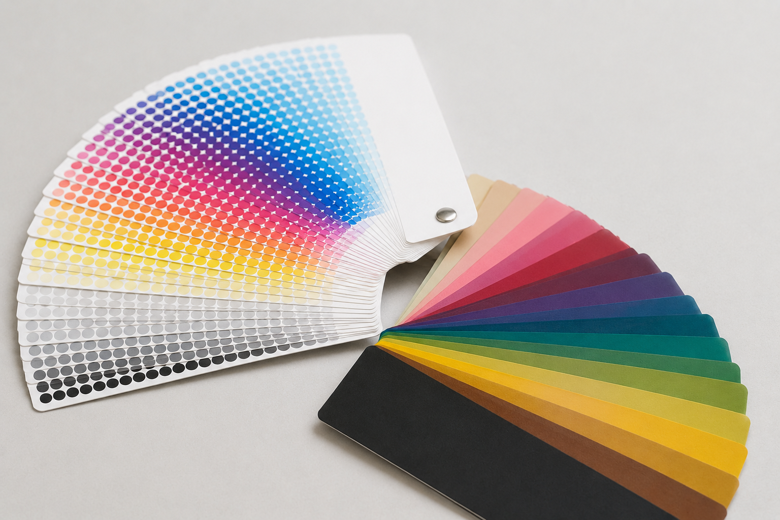
Colour is one of the fastest ways customers recognise a brand, but the process used to print it has a direct effect on how consistent that colour actually looks across bags, boxes and labels. CMYK and Pantone solve the colour problem differently, and knowing which one fits the job avoids costly colour mismatches later.
Understand the basic difference between the two systems
CMYK printing builds colour from four inks, cyan, magenta, yellow and black, layered in small dots to simulate a wide range of colours. It is efficient for designs with photographs, gradients or many colours, since a single print run can reproduce almost any shade using just four ink stations. Pantone, also called spot colour, uses a single pre-mixed ink formulated to match an exact shade, printed as one solid colour rather than built from dots.
The practical difference shows up most clearly in consistency. A CMYK-built colour can shift slightly between print runs or even between machines, while a Pantone spot colour is mixed to a specific formula and reproduces far more consistently run after run.
- CMYK builds colour from four inks layered as dots to simulate a wide range of shades.
- Pantone uses a single pre-mixed ink for one exact, consistent colour.
- CMYK suits photographic or multi-colour designs efficiently.
- Pantone suits brand colours that must stay consistent across runs.
Choose Pantone when brand colour consistency matters most
If a brand has a specific colour tied closely to its identity, such as a signature packaging shade customers recognise on sight, Pantone is usually the safer choice. Because the ink is mixed to a fixed formula, the same shade should print consistently whether the order is placed this month or a year from now, which matters for brands that reorder packaging repeatedly.
Pantone does typically cost more per colour, since it requires a dedicated ink station, but for a brand's primary colour this cost is often justified by the consistency it protects.
- Use Pantone for a brand's core, recognisable colour.
- Pantone gives more reliable colour matching across repeat orders over time.
- Expect a higher per-colour cost due to dedicated ink mixing.
- Share the exact Pantone code, not just a colour name, to avoid ambiguity.
Choose CMYK when the design has many colours or photography
Packaging that includes product photography, illustrations with many colours, or gradients is usually better suited to CMYK, since reproducing that same range in individual spot colours would be impractical and expensive. CMYK is also generally more economical for designs that do not depend on one exact recognisable colour.
The trade-off is that CMYK colour can vary slightly depending on the printer, paper stock and even humidity during production, so a brand's most important colour should not be left entirely to CMYK if consistency is critical.
- Use CMYK for photography, illustrations or gradient-heavy designs.
- CMYK is generally more economical for multi-colour designs.
- Expect some natural colour variation between print runs with CMYK.
- Avoid relying on CMYK alone for a brand's single most important colour.
Combine both processes when it makes sense
Many packaging jobs use CMYK for the bulk of the design and add a single Pantone spot colour for the logo or a key brand element, getting the efficiency of CMYK for general artwork while protecting the one colour that needs to match exactly every time. This combined approach is common on boxes, bags and labels that include both photography and a branded colour block.
Combining processes does add a small amount of cost and setup complexity compared with using CMYK alone, so it is worth reserving the Pantone addition for the colour that genuinely needs the protection, rather than adding it by default.
- Use CMYK for general artwork and a spot Pantone for the key brand colour.
- This combination is common for boxes, bags and labels with both photography and branding.
- Expect a small cost and setup increase compared with CMYK alone.
- Reserve the Pantone addition for colours that truly need exact matching.
Confirm colour on a physical proof before full production
Screen colours, printed proofs and final production runs can all look different from one another, since monitors display colour differently from printed ink on paper or board. A physical proof, checked under normal lighting, is the only reliable way to confirm that a colour will look right once printed at full scale.
This step matters most for the brand's primary colour, where even a small shift can be noticeable to customers who already associate a specific shade with the brand.
- Always request a physical proof rather than judging colour from a screen.
- Check the proof under normal, consistent lighting conditions.
- Pay closest attention to the brand's primary or most recognisable colour.
- Keep an approved physical proof on file to reference for future reorders.
Common questions
Is Pantone always better than CMYK?
Not always. Pantone gives more consistent colour matching, but CMYK is more practical and economical for designs with photography or many colours. Many jobs use both.
Why does my packaging colour look slightly different each time I reorder?
This is common with CMYK printing, since the colour is built from four inks and can vary slightly with the printer, paper or production conditions. A Pantone spot colour is more consistent across reorders.
Do I need to specify a Pantone code or just a colour name?
Always share the exact Pantone code rather than a colour name, since names can be interpreted differently while a code refers to one specific, mixable formula.