Most delays and reprints in packaging jobs don't come from the design itself, but from files that weren't set up correctly for how the piece is actually cut, folded or trimmed. Bleed, margins and resolution are easy to overlook on screen but show up immediately once a job is printed and cut.
Understand what bleed is actually for
Bleed is the extra artwork extended past the final trim line, added so that small variations in cutting don't leave an unprinted white edge on the finished piece. Because cutting is a mechanical process, it's never pixel-perfect, so bleed acts as a buffer that absorbs that variation.
Without bleed, any background colour or image that's meant to reach the very edge of a box, bag or tag risks showing a thin white sliver along one or more sides after trimming, which is one of the most common and avoidable production errors.
- Bleed extends artwork past the trim line to absorb cutting variation.
- Any edge-to-edge colour or image needs bleed, not just a full-bleed background.
- A standard bleed allowance is usually a few millimetres beyond the trim edge.
- Confirm the required bleed amount with the printer before finalising the file.
Keep important content inside the safe margin
The safe margin is the inverse of bleed: a buffer inside the trim line where no essential text, logos or barcodes should sit, since minor cutting variation can just as easily shift the trim inward as it can leave an edge short. Anything placed too close to the trim line risks being clipped.
This matters most for text, logos and barcodes, since a slightly cropped background is rarely noticeable but a clipped word or an unreadable barcode is an obvious, visible error on a finished piece.
- Keep text, logos and barcodes inside a safe margin from the trim edge.
- Decorative background elements can extend closer to the edge than essential content.
- Barcodes need extra clearance to remain scannable after trimming.
- Check safe margin requirements separately for folds, since folded edges need their own buffer.
Set resolution and colour mode correctly before export
Print artwork should be built at a resolution suited for physical output, since screen resolution and print resolution are not the same thing. Images that look sharp on a monitor can appear blurry or pixelated once printed at full packaging size if they weren't created or scaled at a sufficient resolution to begin with.
Colour mode matters just as much as resolution. Files built in RGB, the colour mode used for screens, need to be converted to CMYK, the colour mode used for print, before sending to production, since colours can shift noticeably between the two if this conversion isn't checked and adjusted beforehand.
- Build artwork at a resolution suited for physical print size, not just screen display.
- Convert files from RGB to CMYK before sending to production.
- Check colour shifts after RGB-to-CMYK conversion, since some colours change more than others.
- Flag any exact spot colour requirements separately, since CMYK alone may not match them precisely.
Use the file format the printer actually asks for
Print-ready files are usually requested as a print PDF with fonts outlined or embedded, layers flattened, and bleed and trim marks included, since this format preserves how the design will actually print regardless of what software created it. Sending a native design file instead can lead to missing fonts, shifted layouts or unexpected substitutions on the printer's end.
It's worth confirming the exact file requirements with the printer before final export, since some jobs, particularly those with die-cut shapes or foil and spot UV layers, need additional separate files marking exactly where those special finishes apply.
- Export a print-ready PDF with fonts outlined and layers flattened.
- Include bleed and trim marks in the exported file.
- Confirm whether die-lines or special finish layers need to be supplied as separate files.
- Avoid sending native design files as the final production file unless specifically requested.
Review a proof against the physical die-line before approving
A flat digital proof doesn't always reveal how artwork will actually sit once a box or bag is folded into shape, particularly around gussets, tabs and glue flaps, which can obscure or reposition design elements that looked fine on a flat layout.
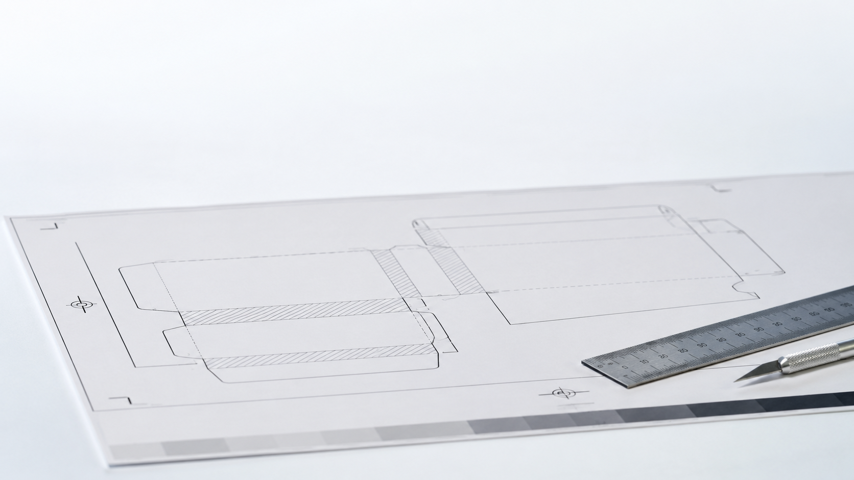
Requesting a physical or 3D proof, or at minimum reviewing the flat artwork laid over the actual die-line template, helps catch issues like a logo landing on a fold or a pattern misaligning at a seam, before the full run is committed to print.
- Review artwork against the actual die-line template, not just a flat design mockup.
- Check that no key design element lands on a fold, glue flap or seam.
- Request a physical or 3D proof for structural packaging before full production.
- Approve the final proof only after checking it against the die-line, not the original design file.
Common questions
How much bleed should I add to packaging artwork?
A standard bleed allowance is typically a few millimetres beyond the trim line, though the exact amount can vary by printer and product, so it should be confirmed before finalising the file.
Why does my printed colour look different from my screen?
Screens display colour in RGB while print uses CMYK. Converting from RGB to CMYK can shift certain colours, so it's worth checking the converted file rather than relying on the on-screen RGB version.
Can I send a native design file instead of a print-ready PDF?
It's best to avoid this unless the printer specifically requests it, since native files can have missing fonts or shifted layouts on a different system. A flattened, print-ready PDF preserves the design as intended.